Tuesday 22 October 2013

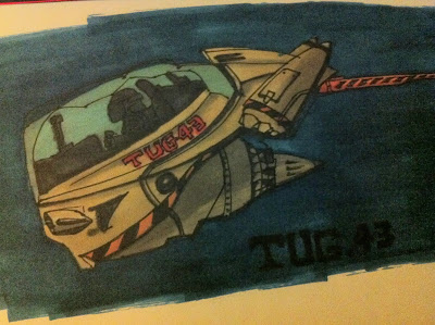
Mining Tug.43- ProMarker Media Test #5

TUG - 43 - Mining Cargo Tug Concept.


Having carried out more research, specifically looking to Scott Robertson, Feng Zhu & Francis Tasi, for both practical skill building and theoretical research purposes. Continuing on from the last post (#4) where the mining corporation 'Fabricom' was introduced as a potential story point to the project.

A question cropped up:
 'How would this mining corporation move Cargo?'

Thus Tug.43 was created as a small media test, using ProMarkers -following on from some of the useful information I had learned while researching the concept artists listed above... Of course this is only one design, in what could have potentially been an endless amount of design possibilities and far for perfection in terms for the actual drawing.
  • While Scott Robertson gave insight into design  and the necessity of good line drawing.  A glimpse of traditional media was picked up in the form of marker usage.
  • Fend Zhu gave great insight into.the need to expand the brain's visual library,  being able to recall details of objects from the mind and using them to help inform the drawing and design.  
  • While Francis Tasi touched upon the need for 'Greebles' - an industry term used by both 2d & 3d designers and illustrators to describe the details of complex-looking mechanical elements that are used to add visual interest and complexity to an image. Which in turn touches back upon the need to improve the brains visual library.


Friday 18 October 2013

Planet Progression & Development Media Test #4


After some brain storming and mind maps, the original 2D planet image was revisited and a fictitious idea was applied to it. In order to spark a sense of purpose to the image and project, it was decided that a sense of story would be best applied to the project in order to justify it.

Having realised that the project might come up short if the only focus was to be 'world building' as per the original plan. The realisation was made that some sort of relevance was needed in order to justify this continued course of action. If a background story  was to be applied to the image, it would more likely take on a new form of realism - if only in a fictional sense at least. This in turn lead to an epiphany that the story would underpin the basis of the project and re-enforce the overall outcome of the final project.

While the initial planet image was akin to a barren desert planet, possibly unable to support life, some greenery was added. Further more part of the planet was left barren and developed to give it a slightly more decimated look. The idea of mining was applied to explain it's final visual image - A habitable planet that was slowly being turned into a barren body of rock, stripped of its valuable resources by a mining corporation, in order to supply raw materials to a galactic civilisation contained within a fictional universe.

Thus the birth of the Fabricom Mining Corporation... The name stemming from a pick-&-mix style of choices, through the use of a random name generator found on the Internet: [ Seventh Sanctum. ]


Monday 7 October 2013

Holograms? #3

[ Hologram Effect ]
Holograms are projected three-dimensional images which are representative of a person or object. Its a typical form of futuristic ideology often found in a varying range of Sci-Fi and is usually conveyed as a form of visual communication or as a type of entertainment e.g: Star Wars - 3D Chess Game  & Star Trek - Holodecks.

Here again, I've taken the initial image that I created and conducted another media test. This time with the intent of replicating the typical holographic effect [Left ] & a slightly more 'digital' stylized version more akin to what you would find in a film poster [Right ].


Thursday 3 October 2013

New Vs. Old: Digital Distress? #2

[Normal vs. Digital Distress.]
I thought about Sci-Fi as a genre in relation to this project, specifically the typically more retro feel sometimes associated with Sci-Fi. I came to the realisation that older work from this genre usually have an image on screen that typically suffers form a digital distress effect; think old Television Monitors & VHS with scan-lines... So I decided to give it a try myself, using an image I'd previously put together for my last post as a media test.

With digital art, its easy to recreate images containing distress effects that mimic screen grabs from television monitors. Typically using a horizontal line pattern, adding noise filters and adjustments.